Projects
Brochure Design
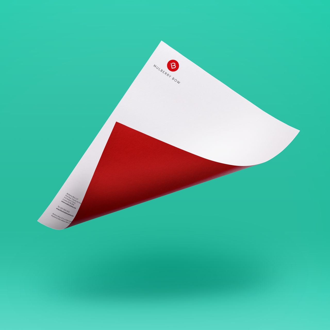
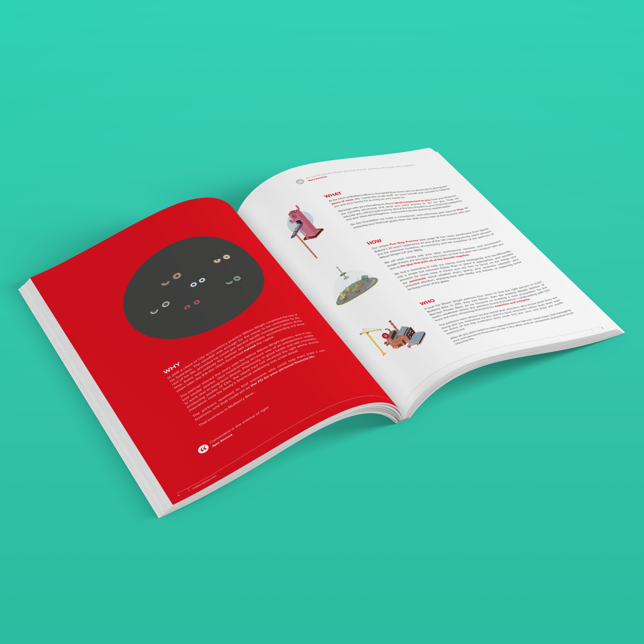
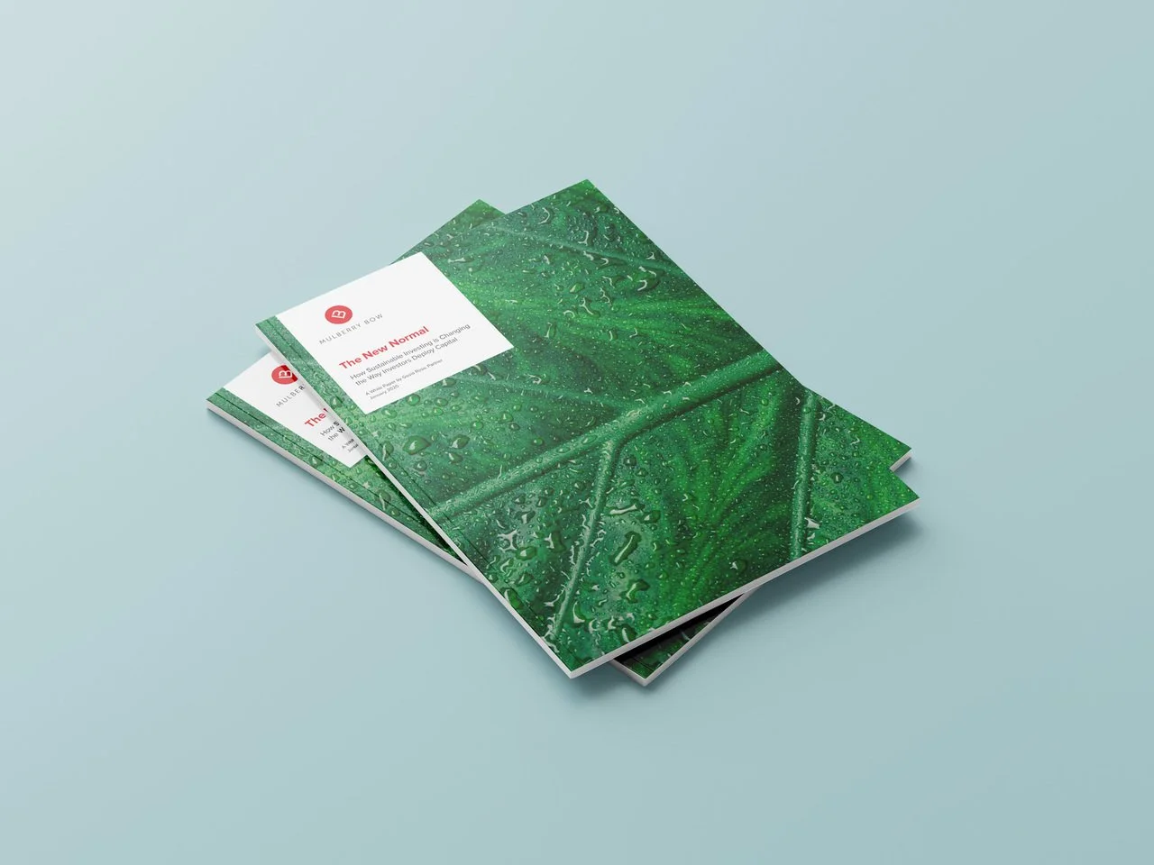
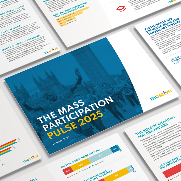
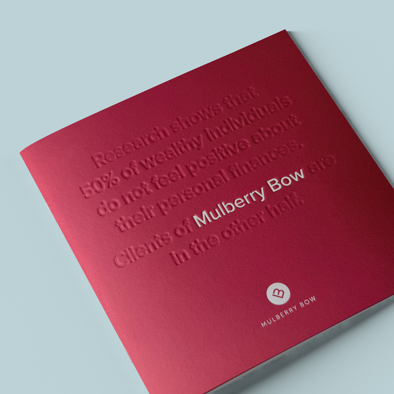
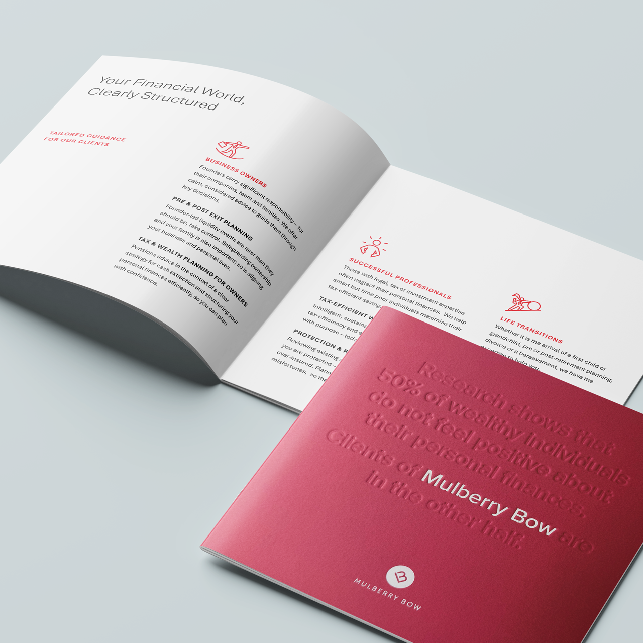
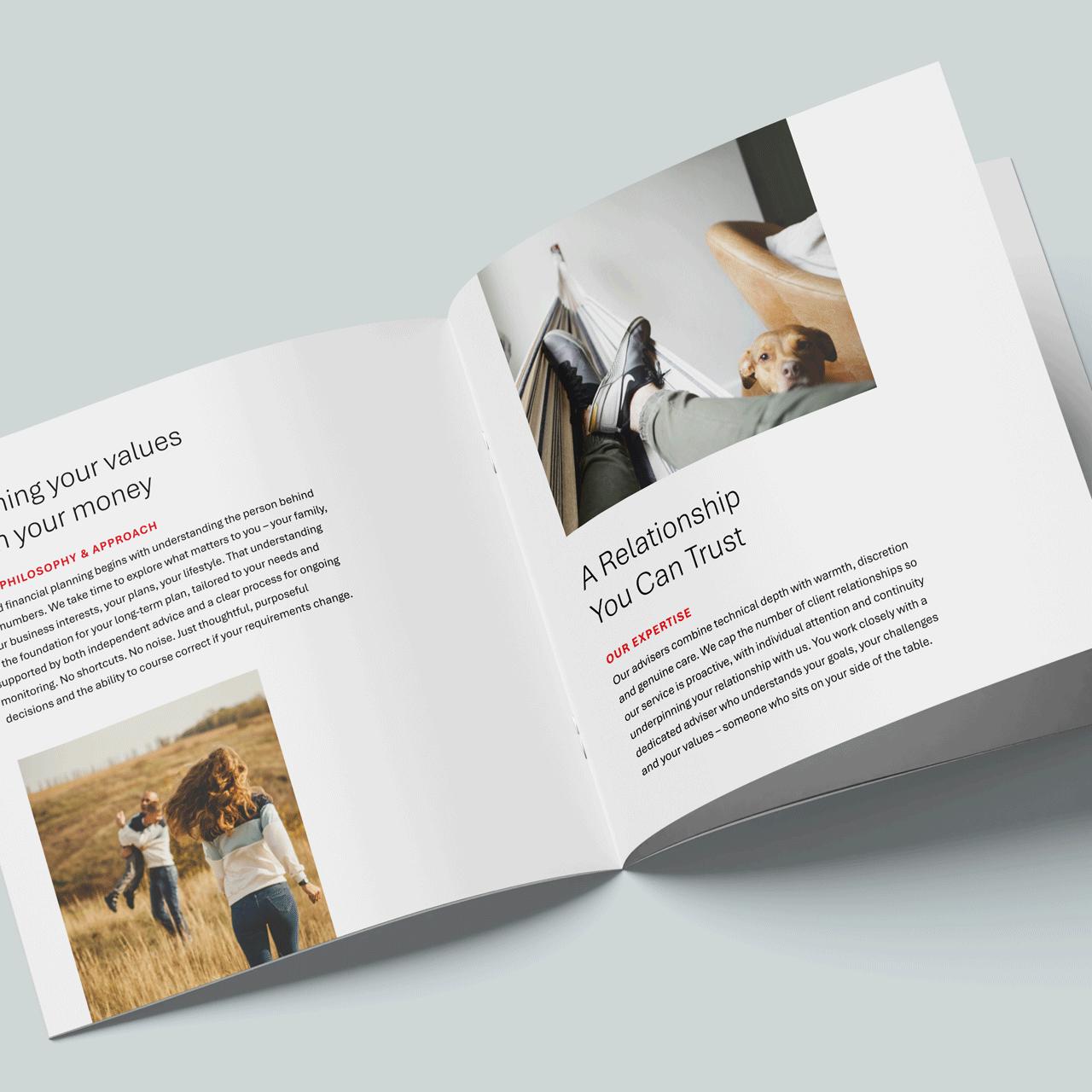
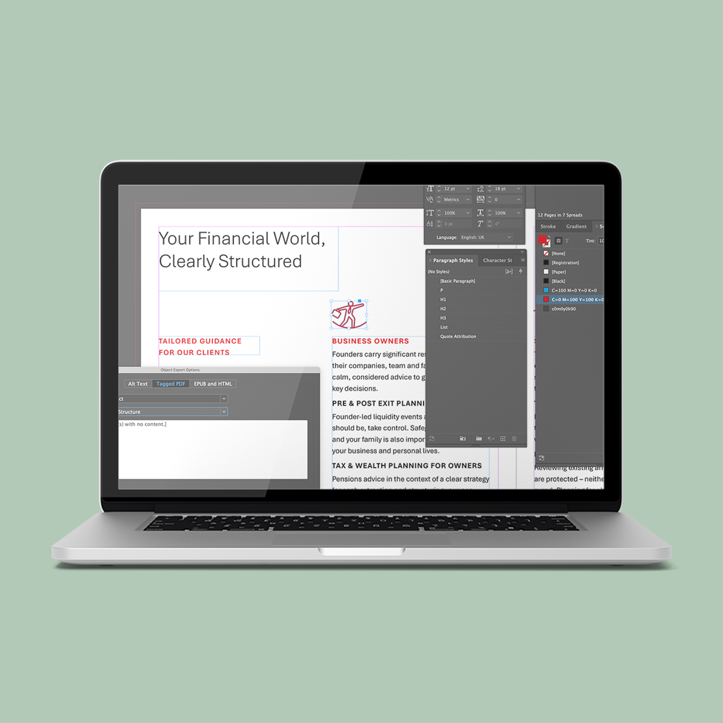
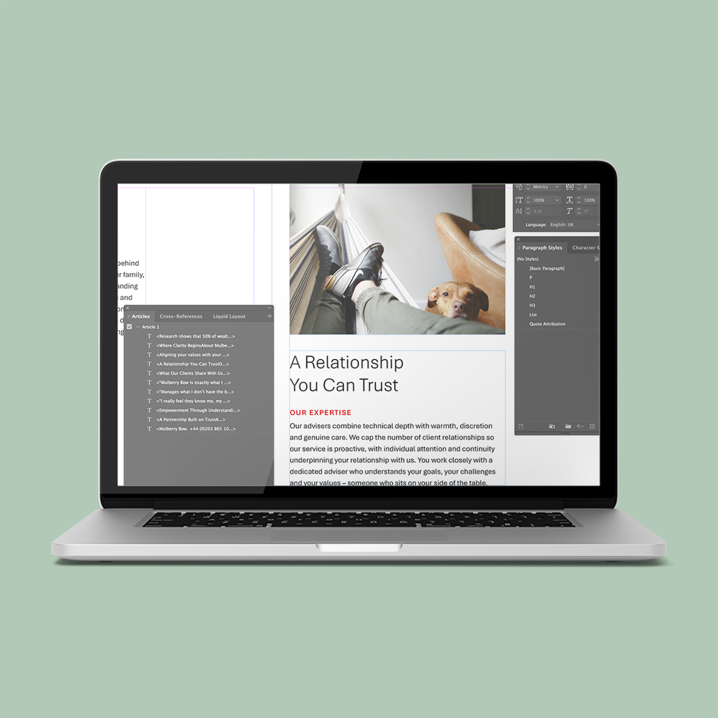
A 12-page brochure produced as a high-end printed piece and a fully accessible digital PDF. The print version uses GF Smith stock with debossing and foil blocking, focusing on material quality, legibility, and restrained layout.
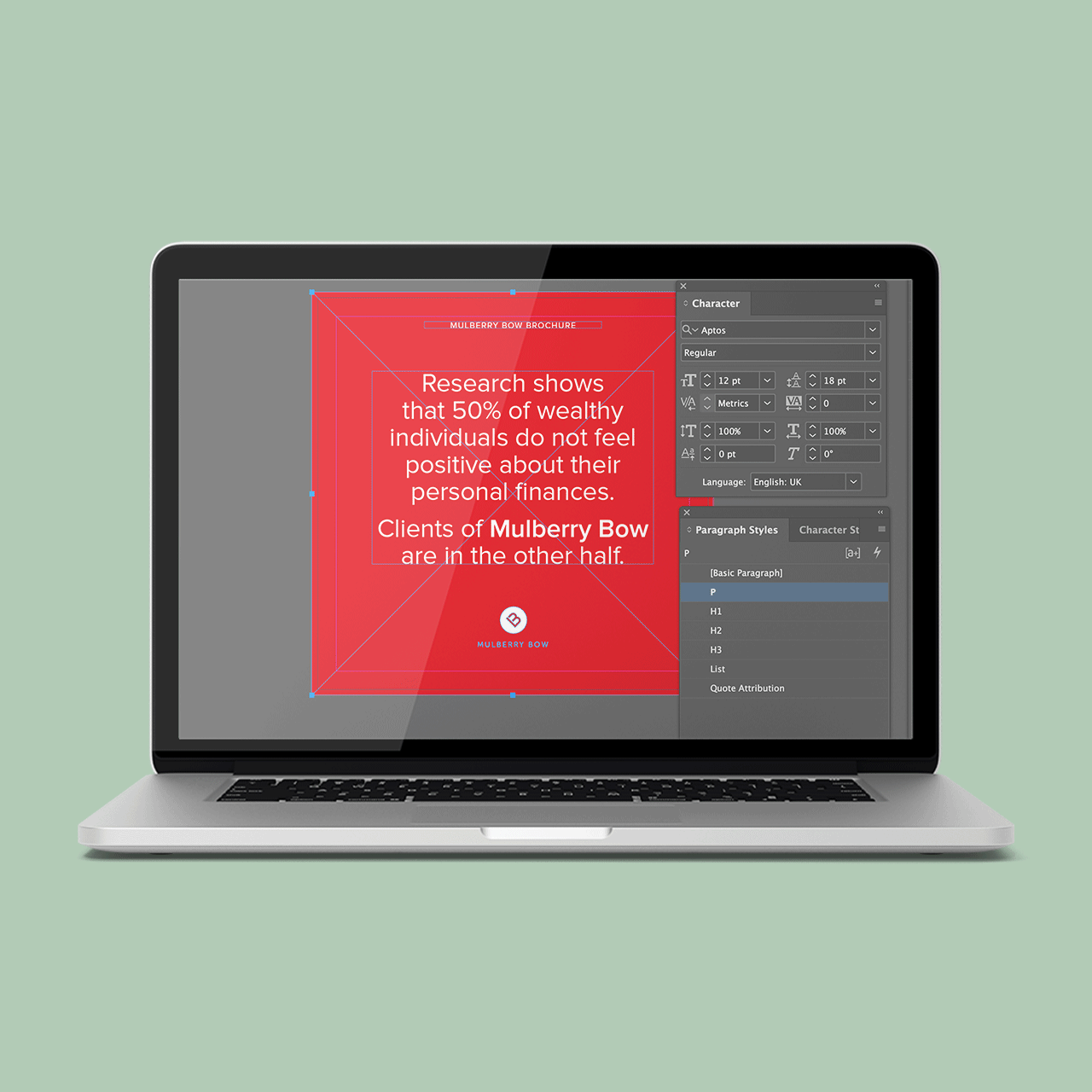
The digital PDF is built to meet accessibility standards, with a logical tag structure, correctly defined headings, ordered reading flow, descriptive alt text for all imagery, increased colour contrast, and full keyboard navigation. Decorative elements are excluded from the reading order, ensuring screen reader users receive clear, meaningful content without visual noise.
Premium Print ExecutionLegible by DesignAccessibility Standards AppliedStructured for NavigationScreen Reader Considered

"Steven combines strong design skills with a genuine understanding of how people interact with information. He delivered a brochure that looked great, communicated our message clearly, and he later adapted it into a fully accessible PDF. His attention to detail and proactive approach made him a pleasure to work with, and I wouldn't hesitate to recommend him."
Simon Bullock – Mulberry Bow, Founder and Executive Chairman
Branding
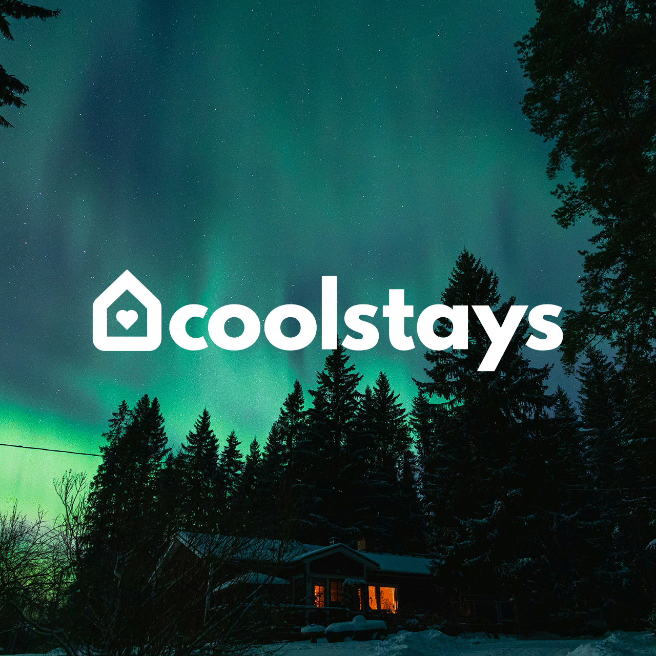
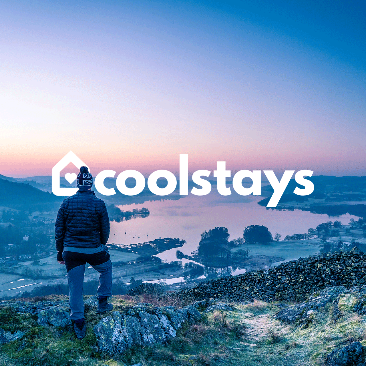
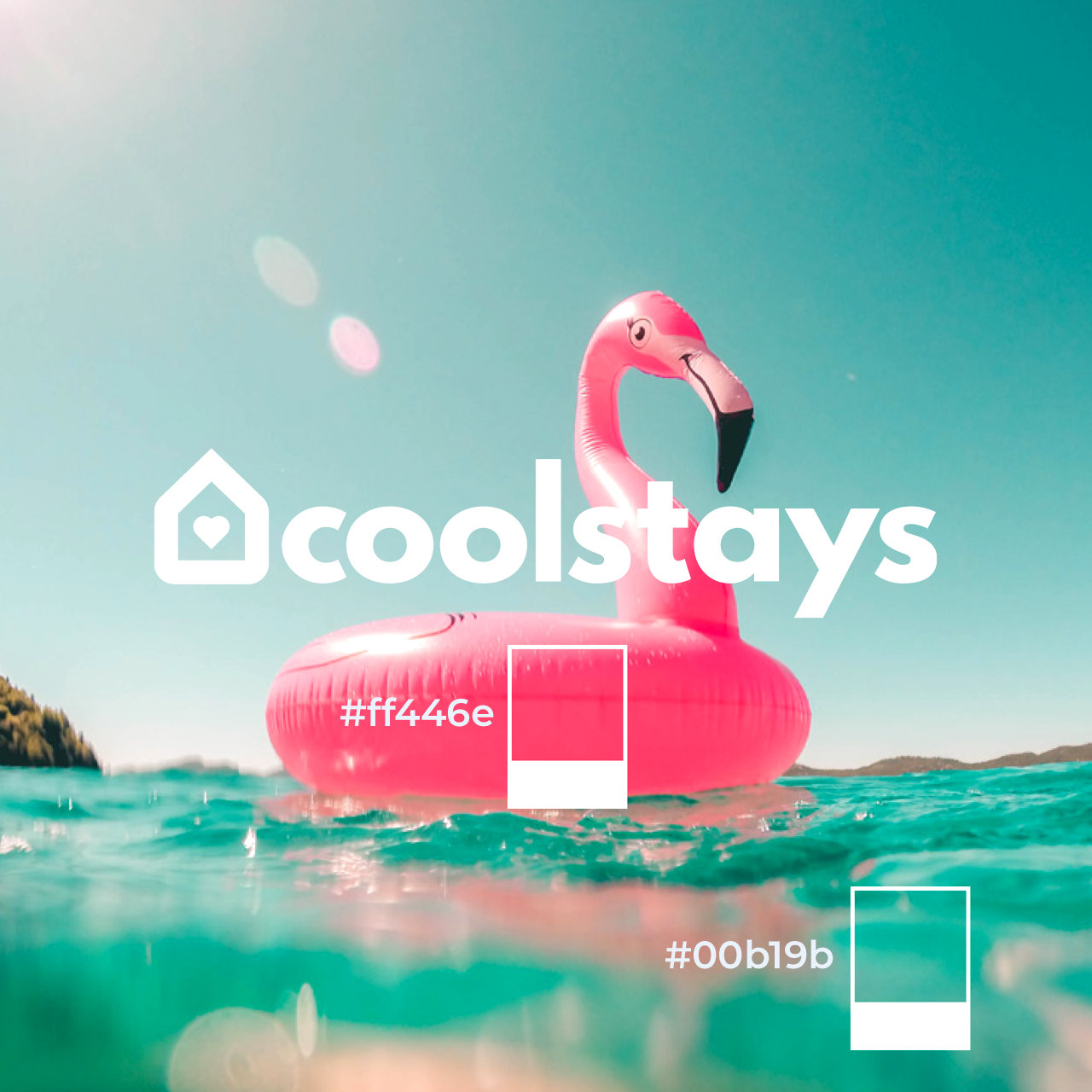
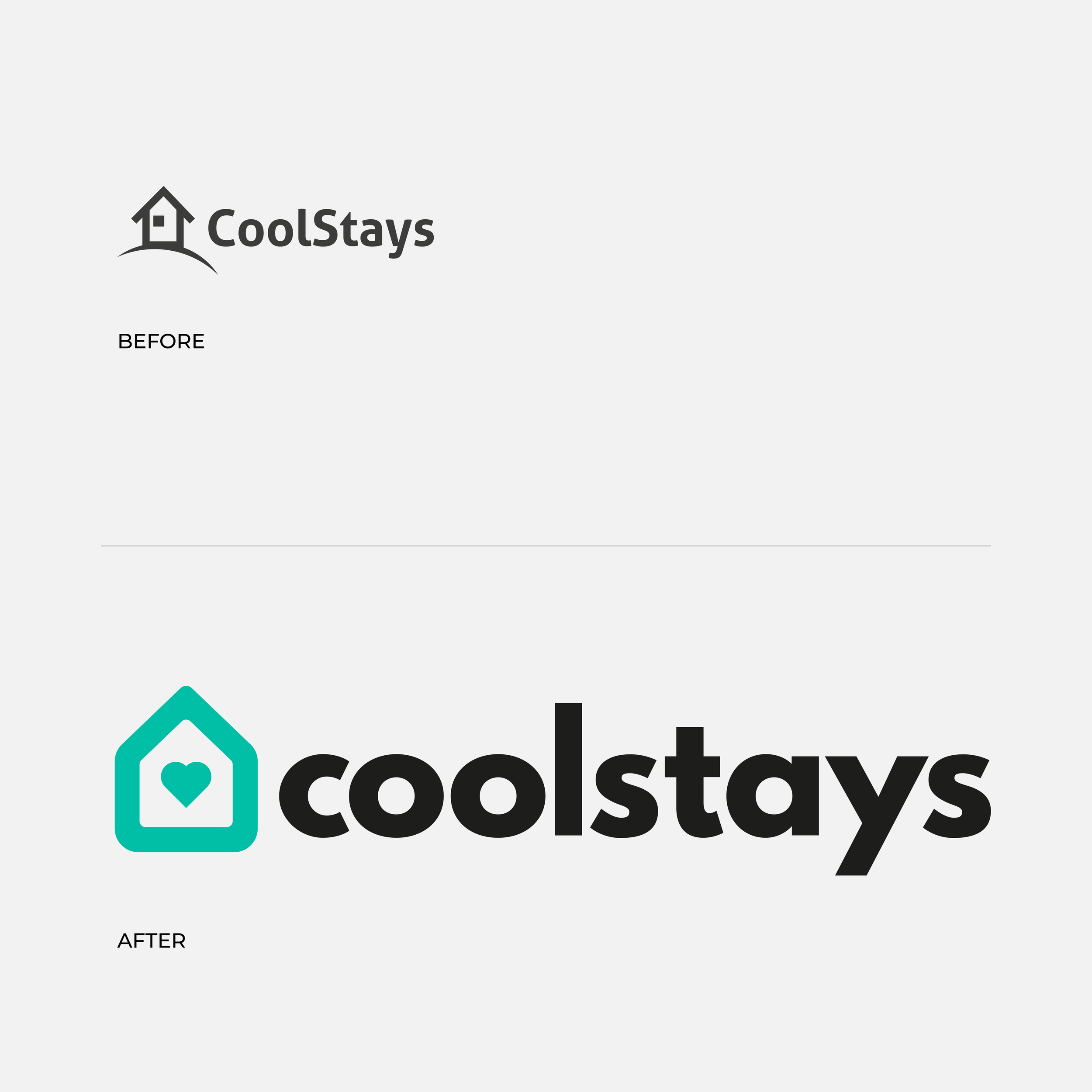
A refreshed identity for Coolstays designed to feel more welcoming, distinctive, and digitally robust. The original logo served its purpose, but lacked clarity and flexibility across modern platforms.
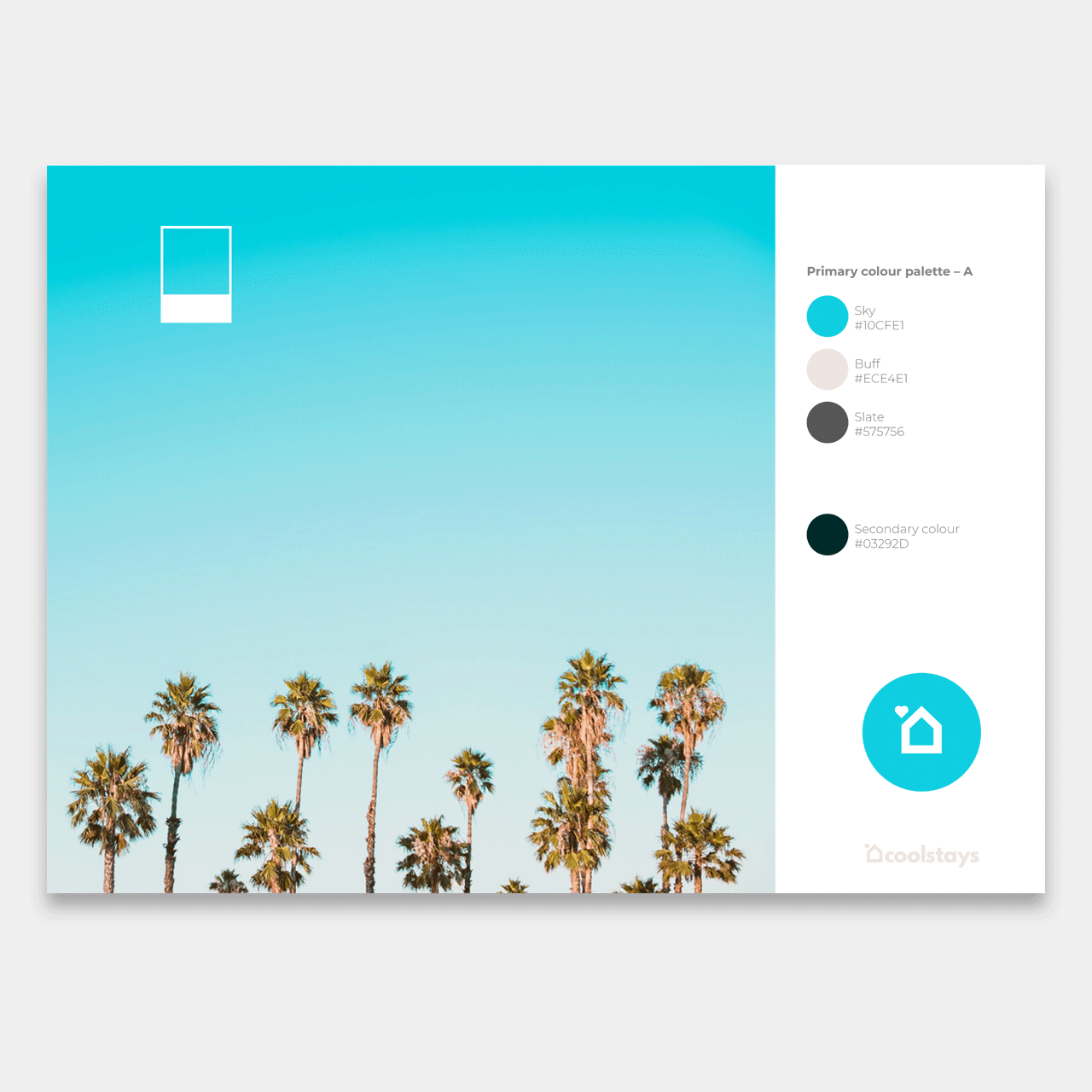
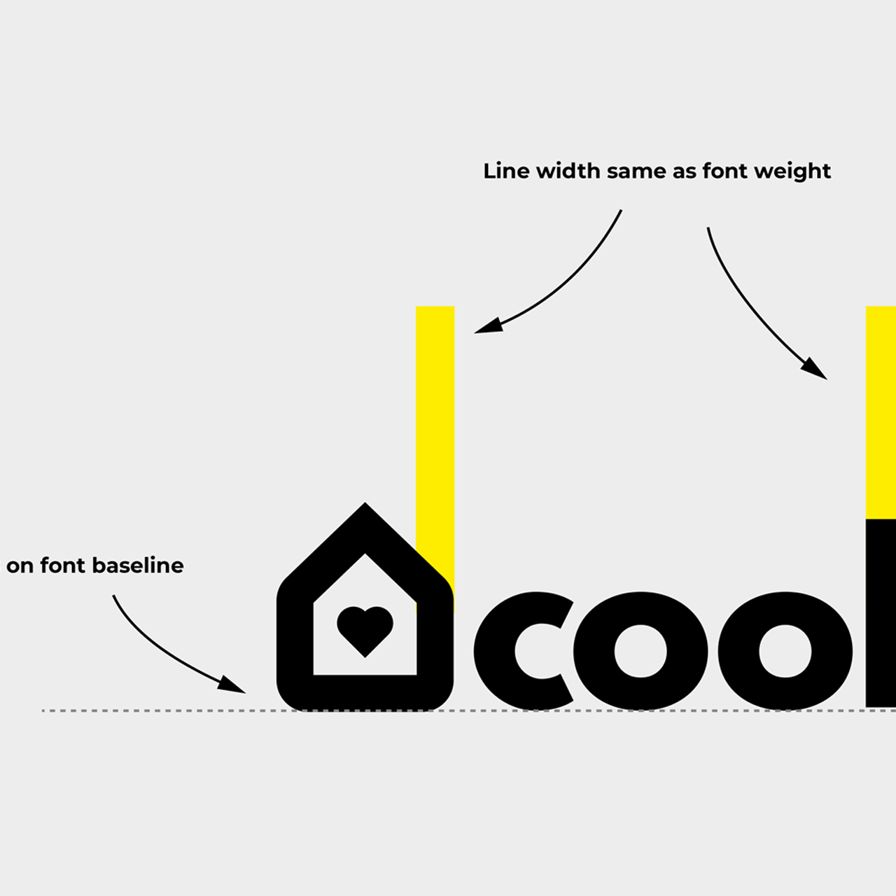
The redesign focused on improving legibility, simplifying form, and refining colour contrast to support accessible use across web and mobile environments. Letterforms were adjusted for clearer reading at smaller sizes, and the icon was streamlined to work confidently as an app icon, favicon, and navigation element.
The result is a brand mark that feels more considered and approachable – built to perform across interfaces while staying true to the personality of the platform.
Digital-First IdentityClearer LetterformsAccessible Colour ContrastSimplified, Recognisable IconComprehensive Brand Guidelines

“I have worked with Steven many times over the years, initially collaborating on website designs and templates for our web design agency, Big Blue Sea. In addition to his work on web design, Steven also handled brand development for several of our clients who needed that service. Since the launch of Coolstays, which is now our core business, Steven has been instrumental in developing our brand to where it is today. I would highly recommend Steven to anyone seeking brand development and logo design.”
Tim Wills – Coolstays, Co-founder
Safe & Equal Brighton
Word → Fully accessible PDF
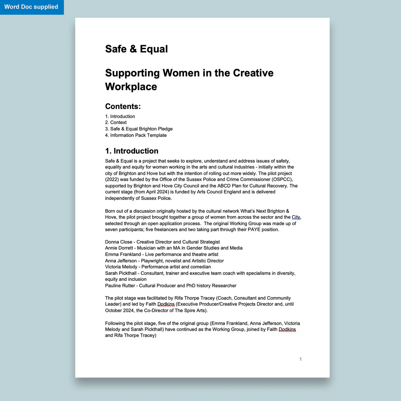
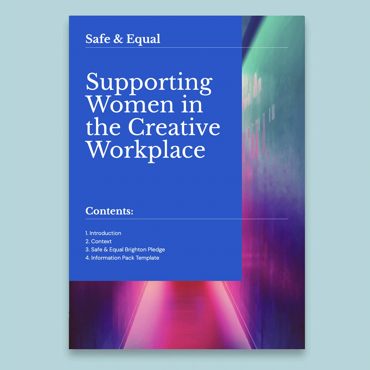
An accessible report design for Safe & Equal Brighton, supporting a local initiative focused on safety, equality and inclusion for women working across the city’s arts community.
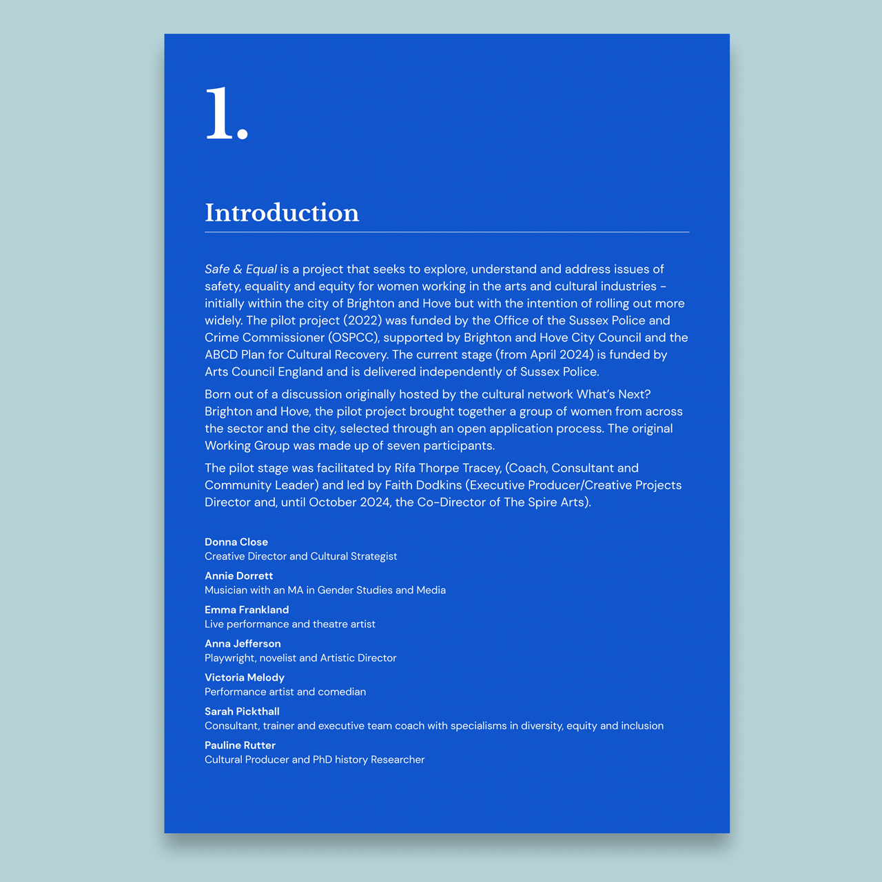
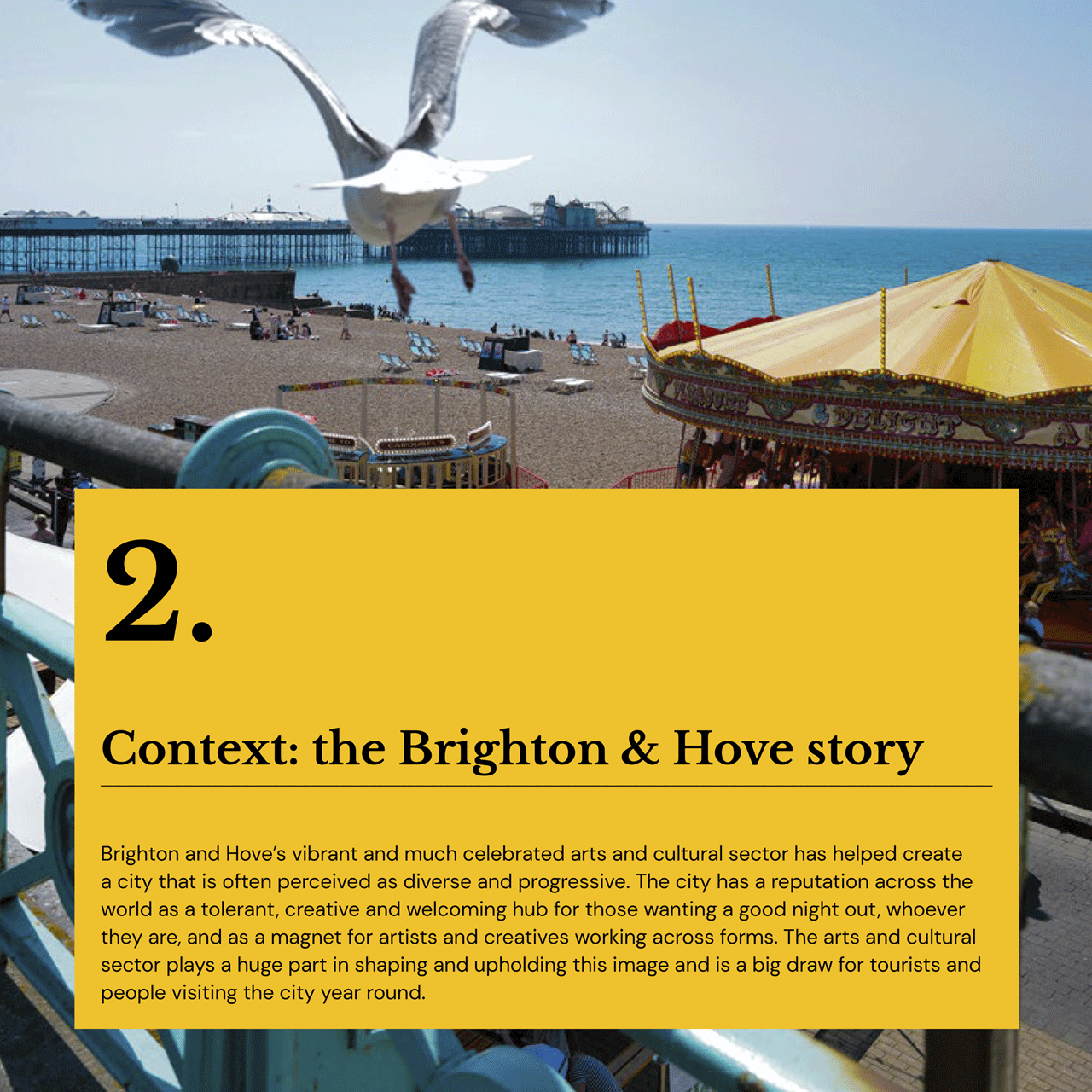
Working from a draft Word document, the content was shaped into a clear, structured PDF – designed to communicate the importance of the work while remaining easy to read and navigate. The approach focused on creating a strong typographic hierarchy and a colourful, engaging and considered layout that supports long-form reading.
The result is a clear, purposeful report – designed to support organisations across Brighton & Hove in creating safer, more inclusive working environments.
Inclusive Design
Long-form Readability
Clear Hierarchy
Accessible Structure
Word → Accessible PDF
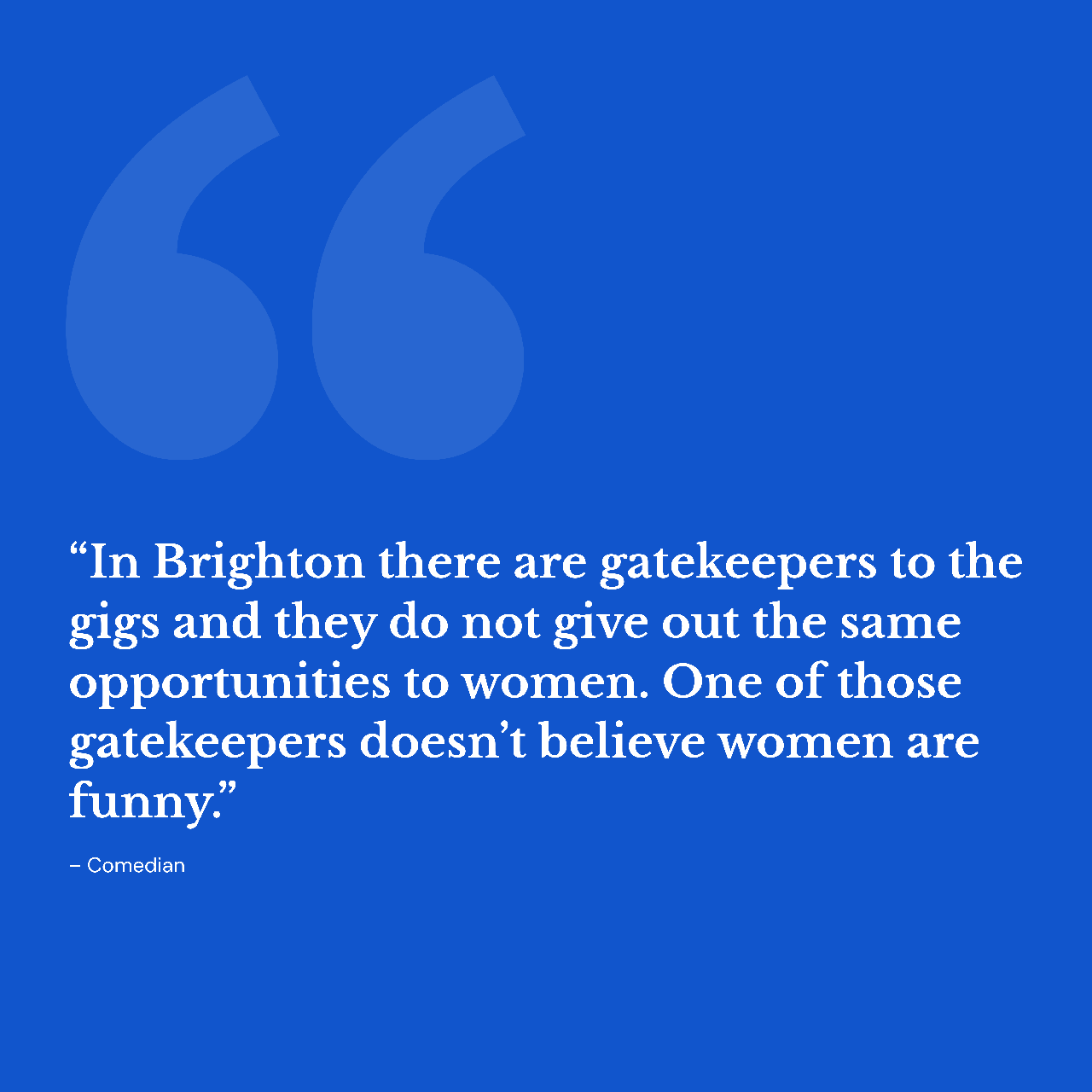
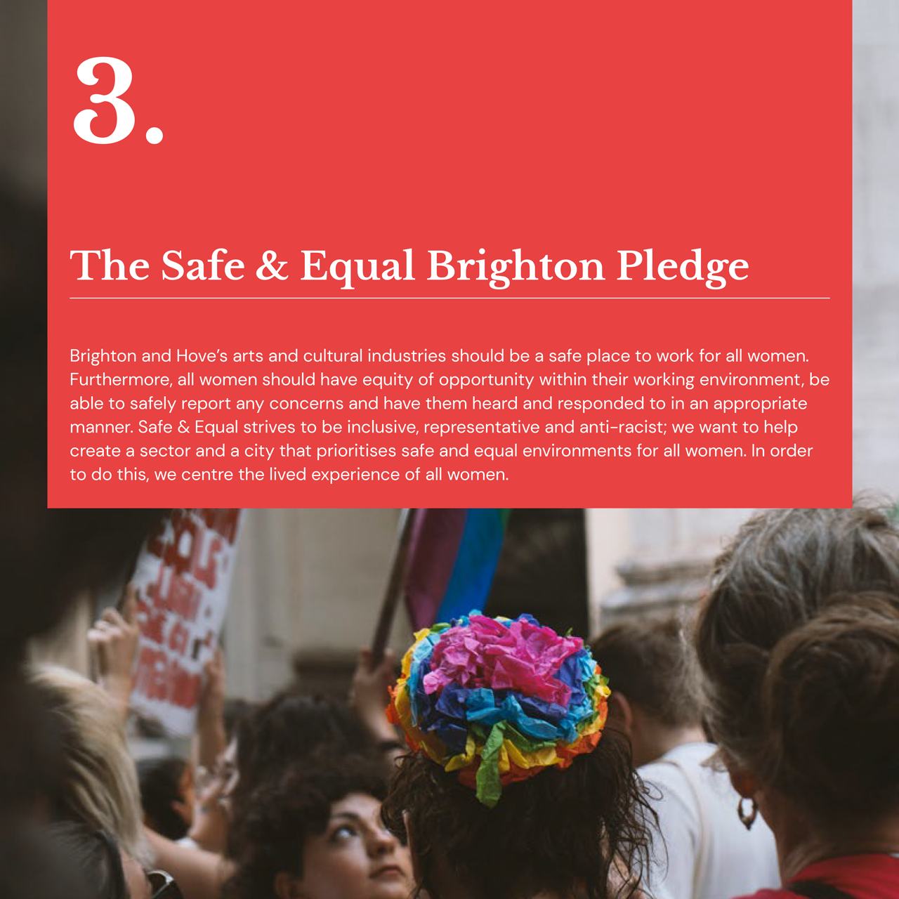

“Steven provided a highly professional and comprehensive design service, managing the entire process seamlessly from concept through to completion. His expertise in accessibility ensured that our document – and, by extension, the project itself – was as inclusive and accessible as possible, enabling it to reach and benefit the widest possible audience. Steven was a pleasure to work with, and I would have no hesitation in recommending his design services or collaborating with him again in the future.”
Faith Dodkins – Freelance Executive Producer / Creative Projects Director
Wayfinding
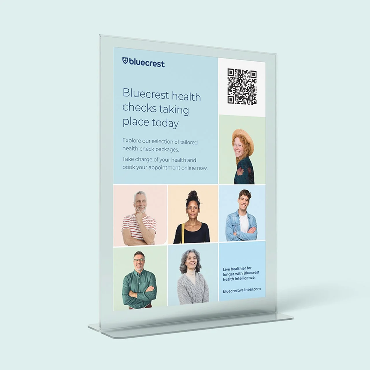
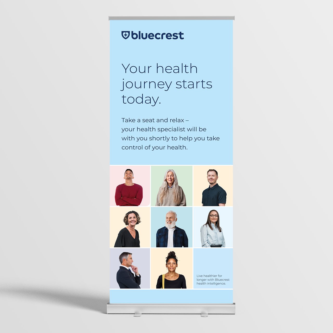
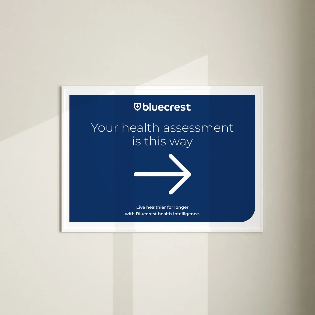
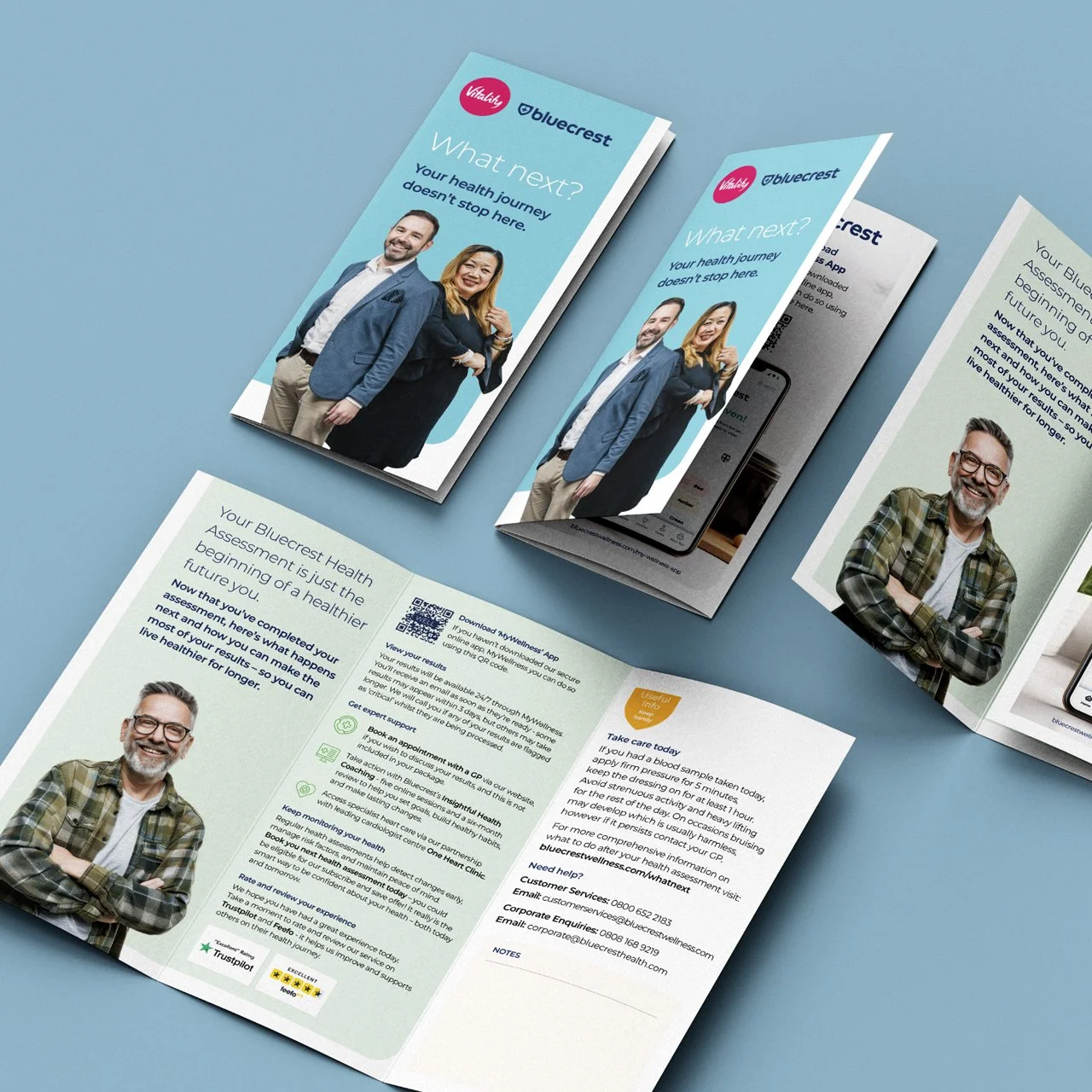
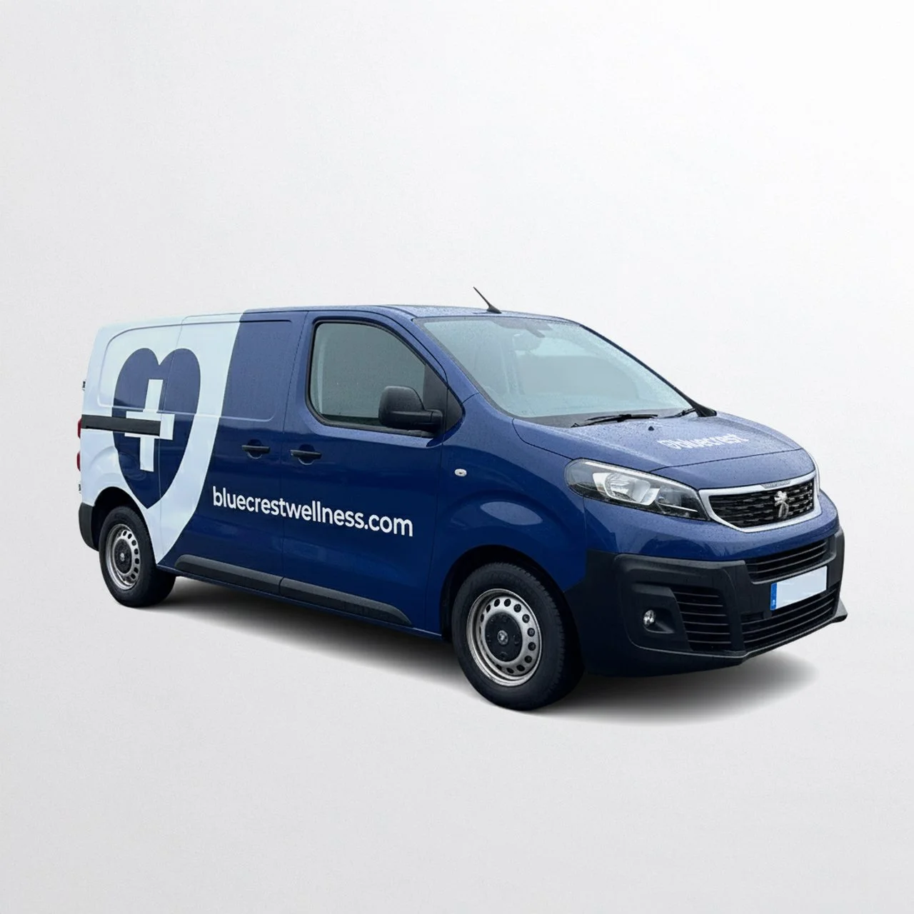
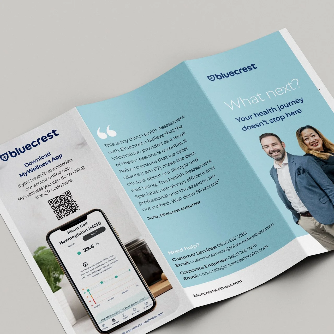
Wayfinding and environmental design for Bluecrest Wellness mobile clinics, delivered across 450+ pop-up locations in venues throughout the UK and Ireland.
Working across a wide range of venues, the focus was on creating a clear and consistent customer journey from arrival through to consultation. A simple system of reception signage, directional guidance and waiting area information was designed to support confident navigation.
Within consultation rooms, materials such as informed consent signage were designed for clarity and legibility. Across all touchpoints, accessibility best practices were applied, including clear hierarchy, considered typography and strong colour contrast.
The result is a consistent, easy-to-navigate experience – supporting customers across a national network of clinics.
Inclusive Wayfinding
Clear Customer Journeys
Environmental Signage
Accessible Typography & Contrast
National Rollout (450+ Locations)
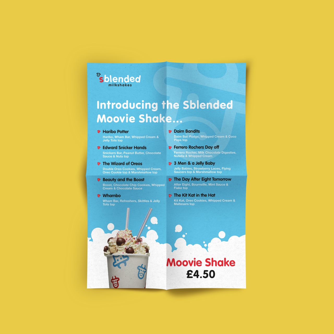
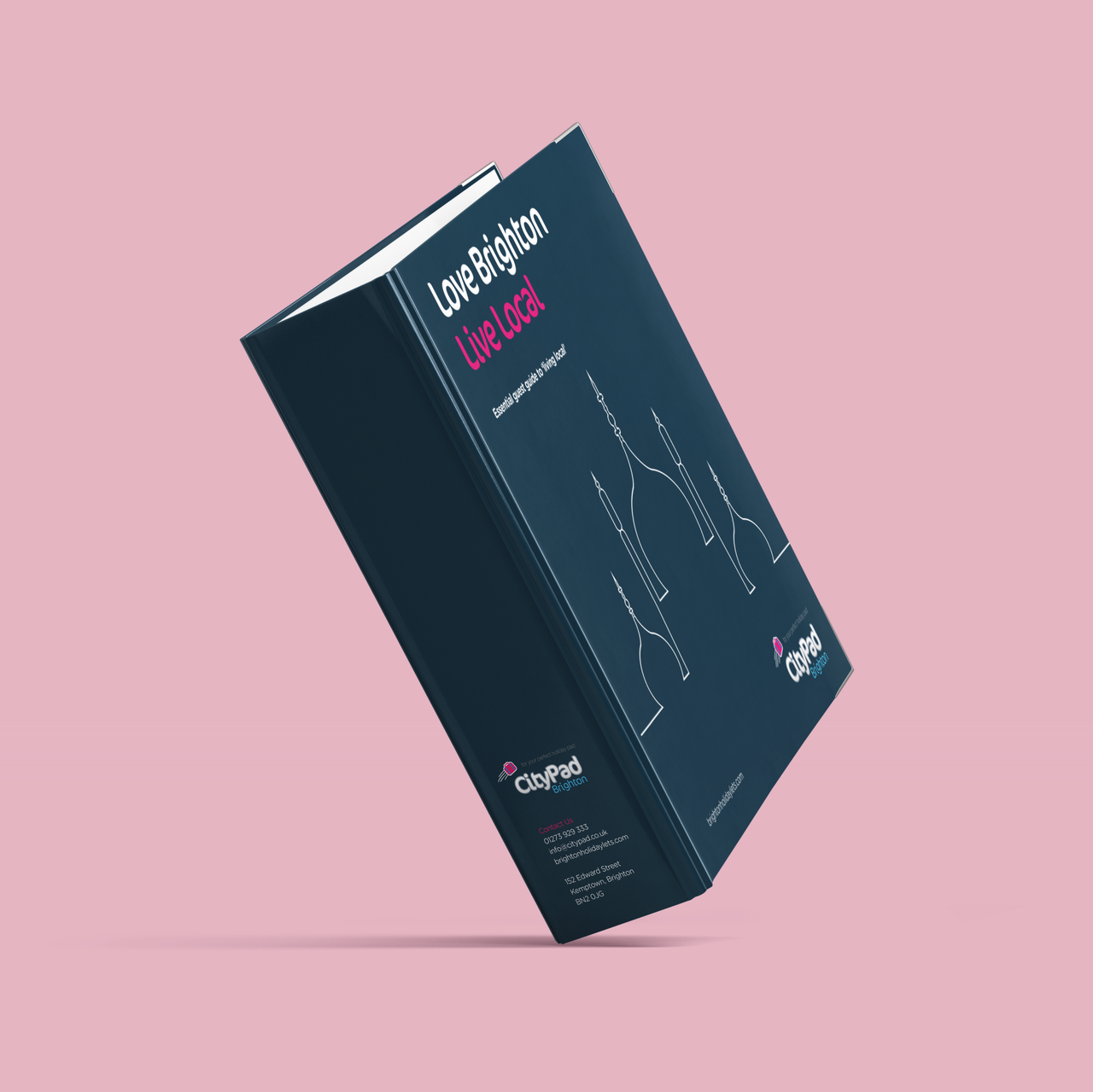
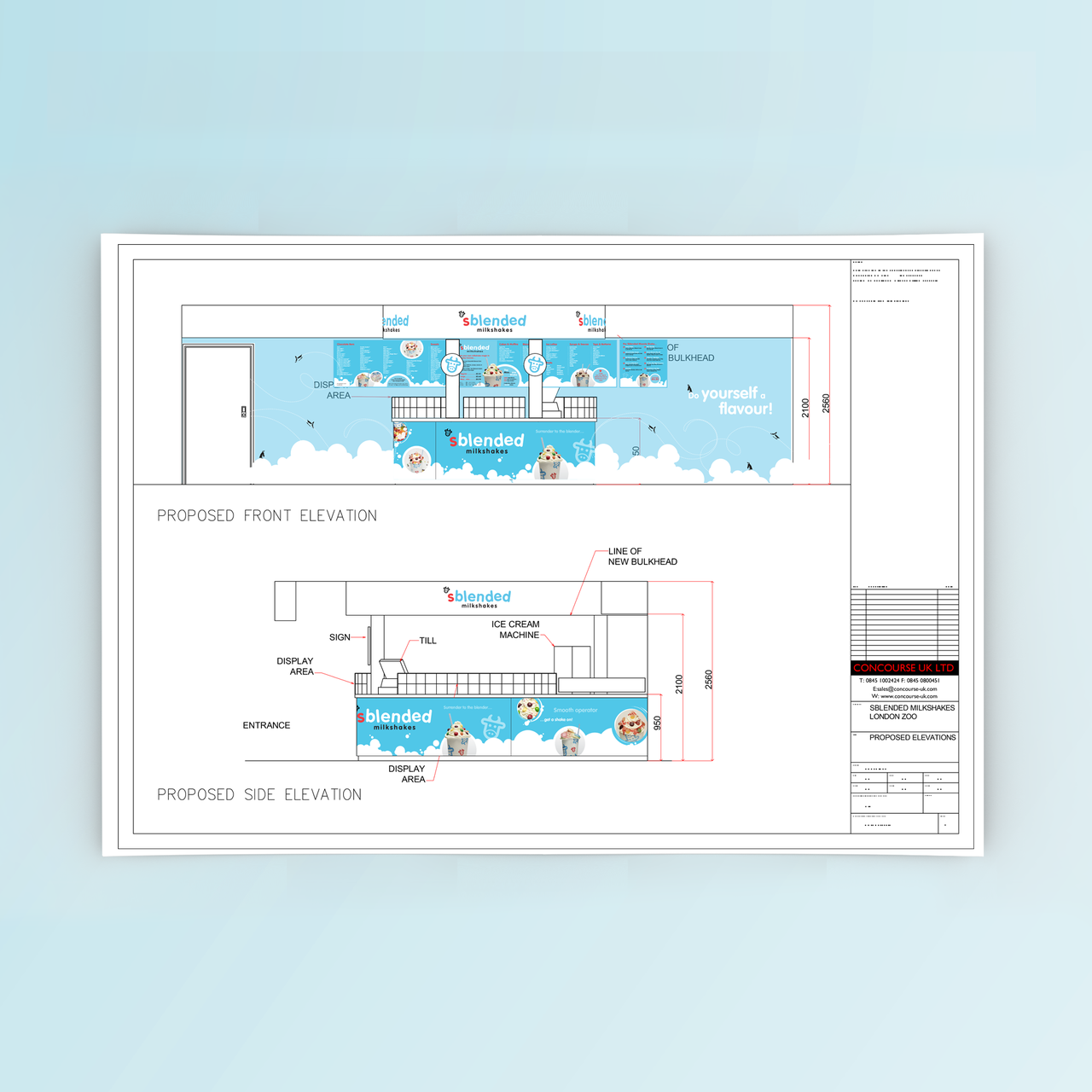
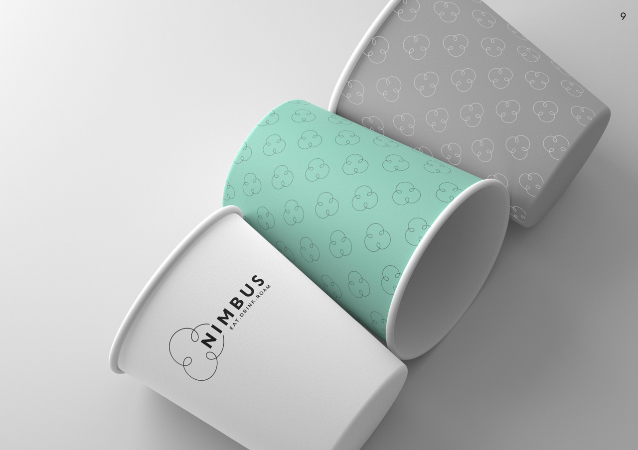
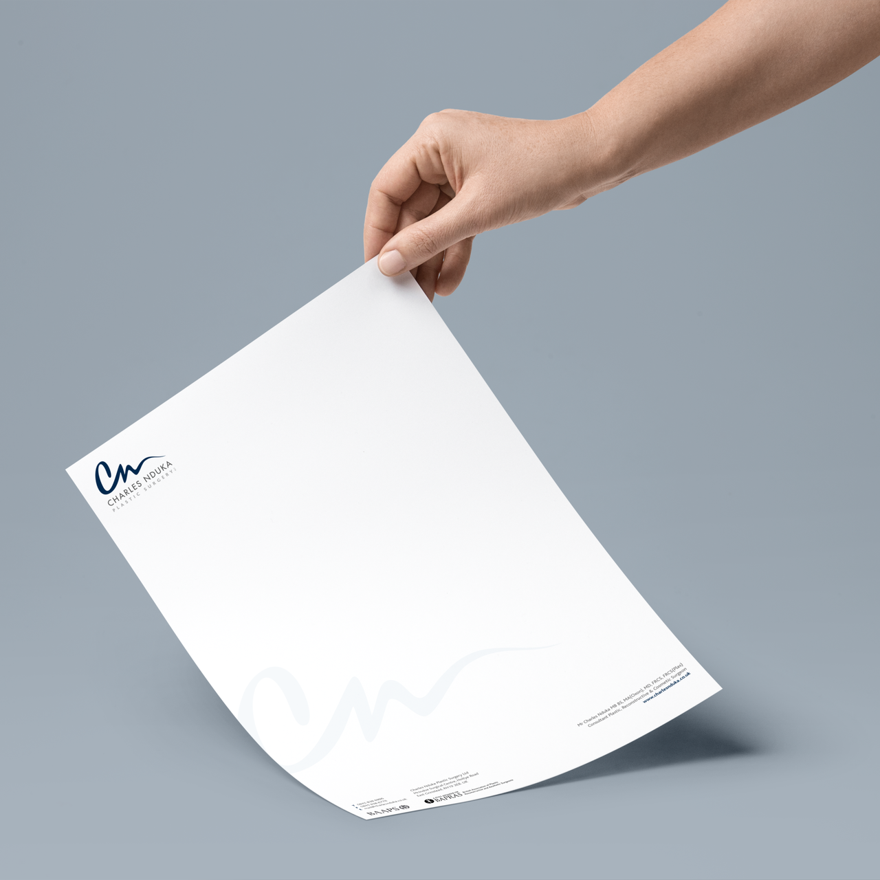
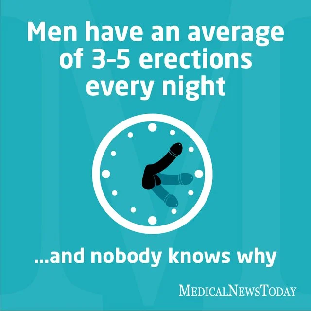
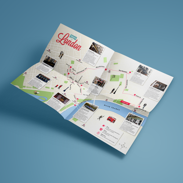
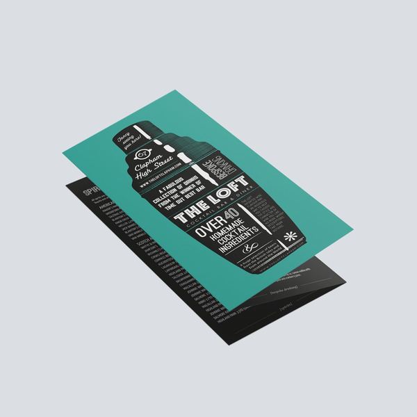
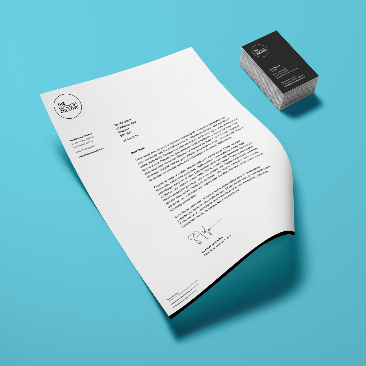
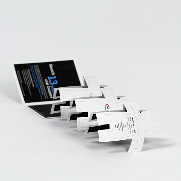
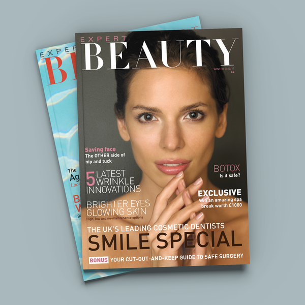
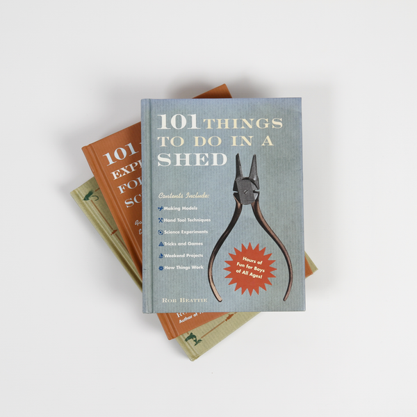
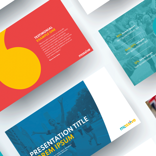
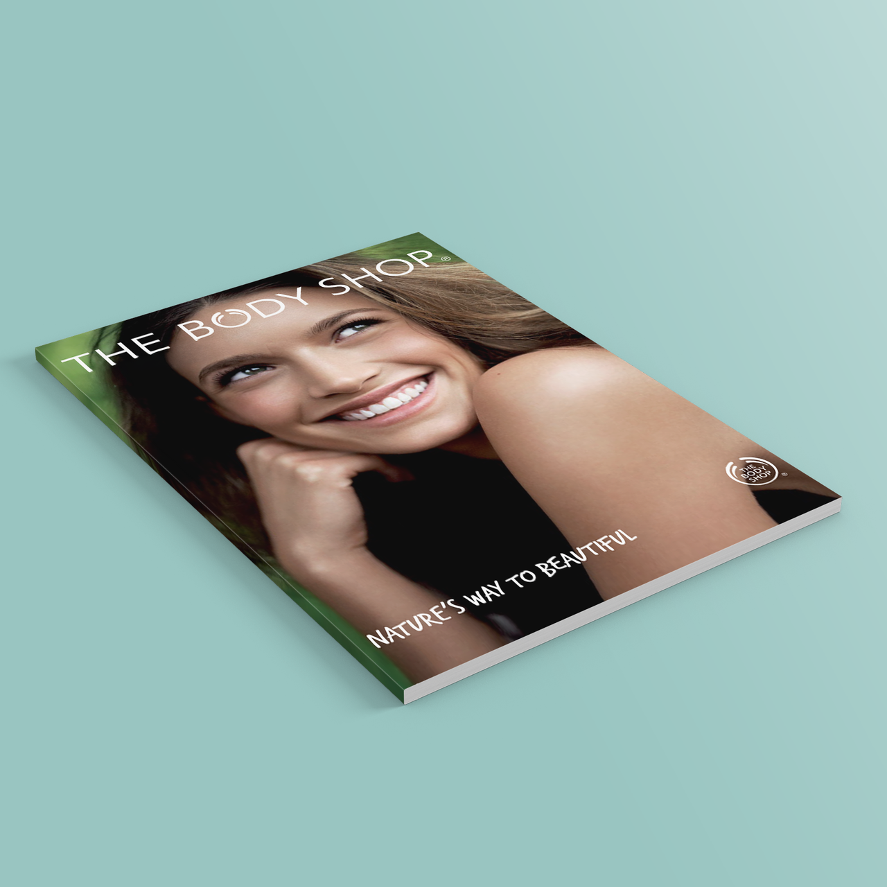
A selection of archive projects from the last 20 years.
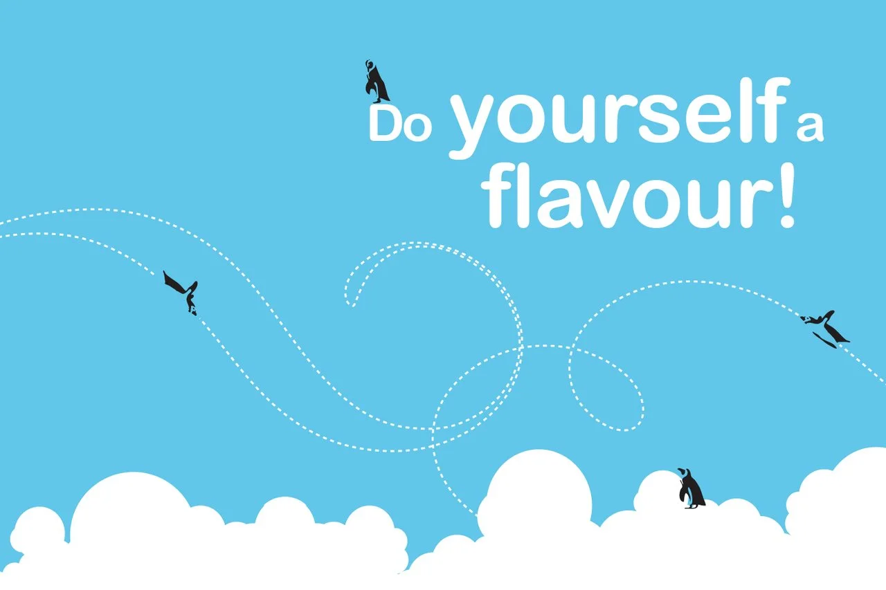
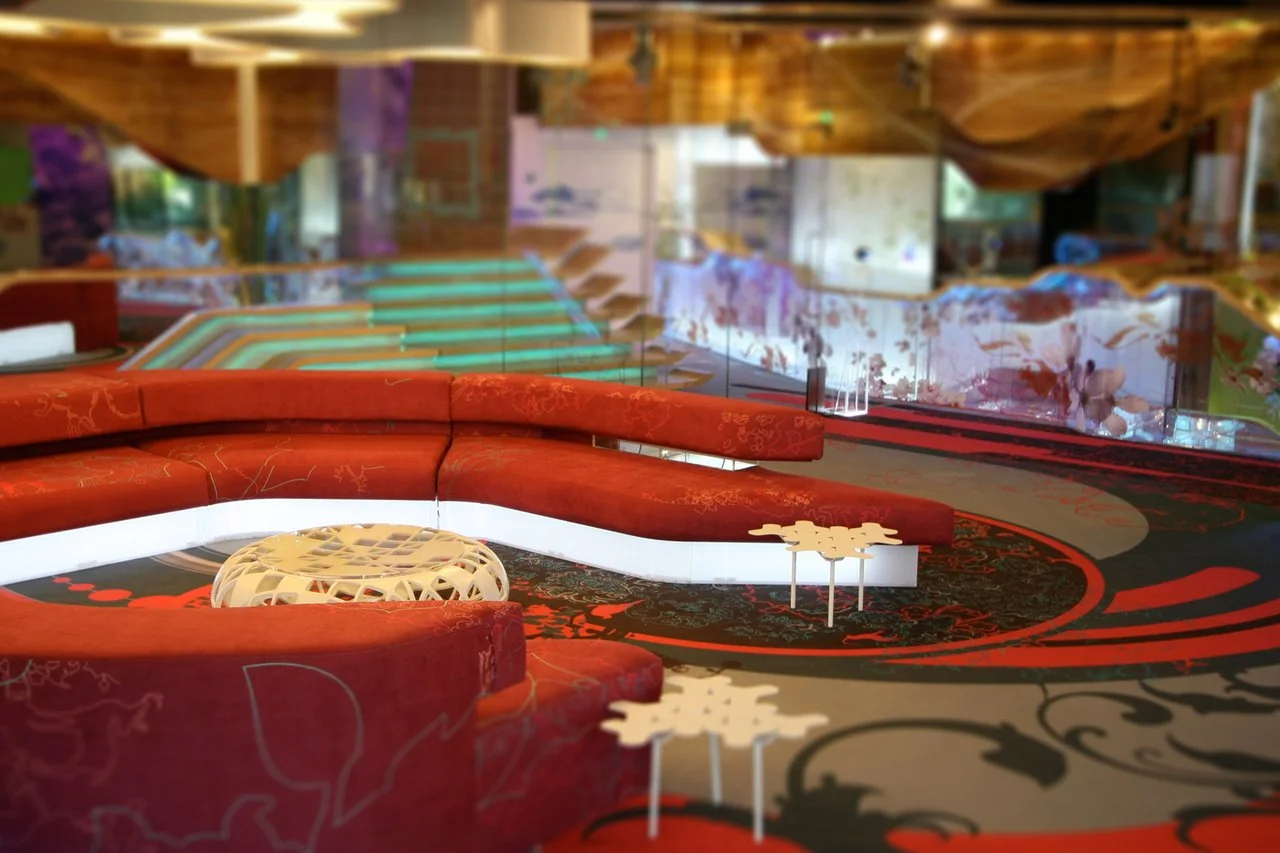
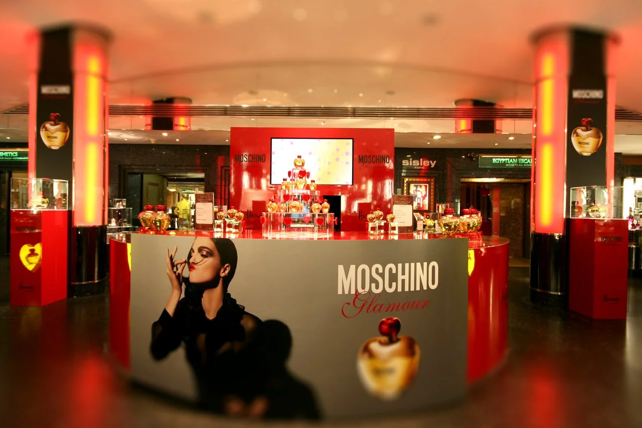
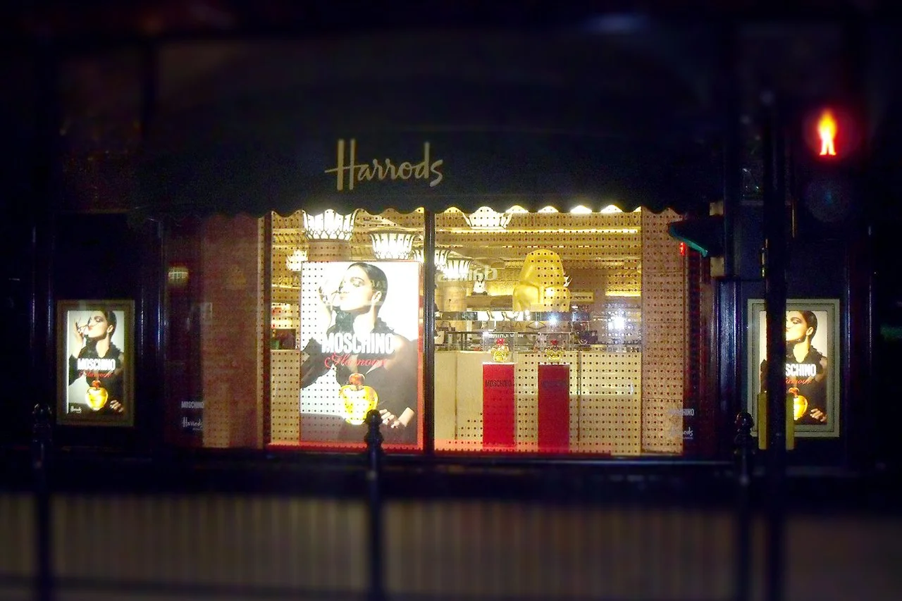
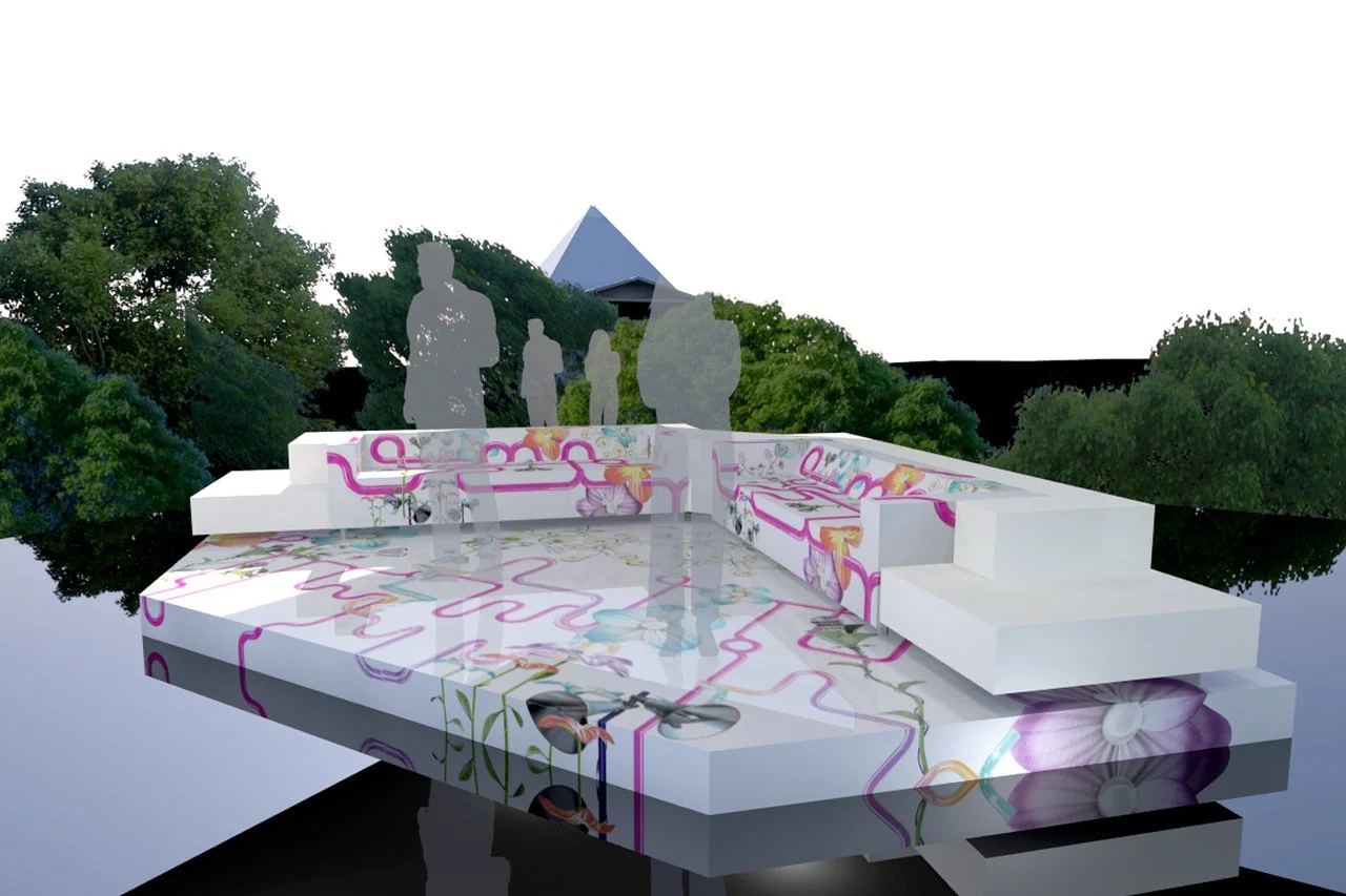
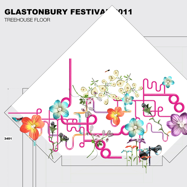
From penguin kiosks at London Zoo to Harrods window displays via the Big Brother house and Glastonbury set design – it's been quite a ride! If anything here catches your eye, I'd be happy to discuss in more detail…